In the last two parts of this article (see links below), we used data from a non-commercial data collector on a 10-hp electric motor to explore how MCSA/ESA (Motor Current Signature/Electrical Signature Analysis) spectra are developed. We looked at the way different windows smooth and filter data so it can be analyzed.
Here, we are reviewing data from a commercial analyzer on a 1-hp, 1765 rpm, 460 Vac motor with a system set at 12 kHz sampling, 65,536 FFT block, and three averages. The data will be separated into a high-frequency set at 6 kHz and a low-frequency, high-resolution set at 180 Hz, with identifying peak values.
Click The Following Links To Read
We will use one phase of current with the first dataset collected across 9 seconds at 12 kHz, resulting in the waveform shown in Fig. 1. Unlike the data analyzed in Parts 1 and 2, small imperfections can be found in the peaks of the sine wave.
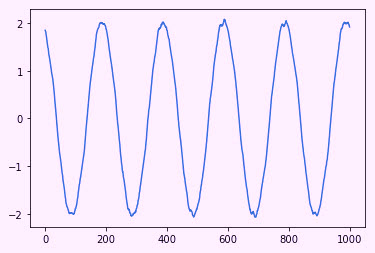
Fig. 1. Waveform data from a 1-hp, 1765 rpm, 460 Vac, 1.47 Amp electric motor.
This data is then converted to a spectra in frequency (x-axis) and -dB with the highest peak selected as ~0dB, as shown in Fig. 2. The full spectra shown in Fig. 2 is based upon the Nyquist of ‘2’ (1/2 of sampling frequency). To compare this with what is found in commercial software, Fig. 3 reflects the same data presented in the software package.
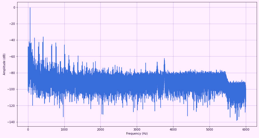
Fig. 2. Current spectra to 6kHz from one phase of a commercial ESA device.
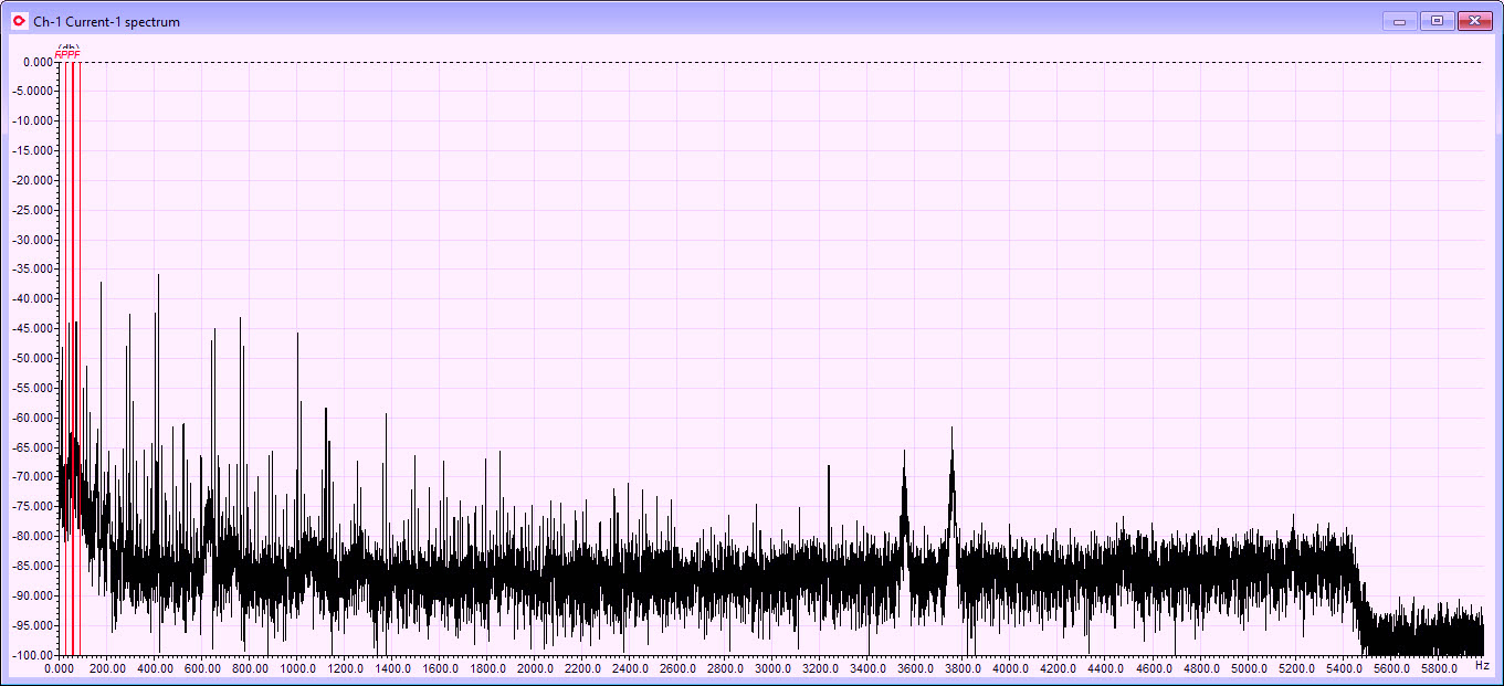
Fig. 3. Same set of data in the commercial software package as that shown in Fig. 2.
Note some differences resulting from data management programming,
which is not addressed in this article.
For this exercise, we’re using Python 3.9 and several program libraries, including SciPy, which produces the spectra and conversion to -dB data. We can also programmatically take the data from Fig. 2 and “zoom” in to see our spectra close to line frequency (Fig. 4). As in Part 2, we are using a Flat Top window in all of the data presented here in Part 3. Another feature in the SciPy library is something called “find peaks,” which, as the term suggests, identifies the peaks as shown in Fig. 4 (i.e., the red x’s). Unfortunately, while the amplitude is correct for the peaks, the data is rounded to integers, so the x’s are not represented on the actual peaks. The way around this in Python is quite involved and, as a consequence, outside the scope of this article.
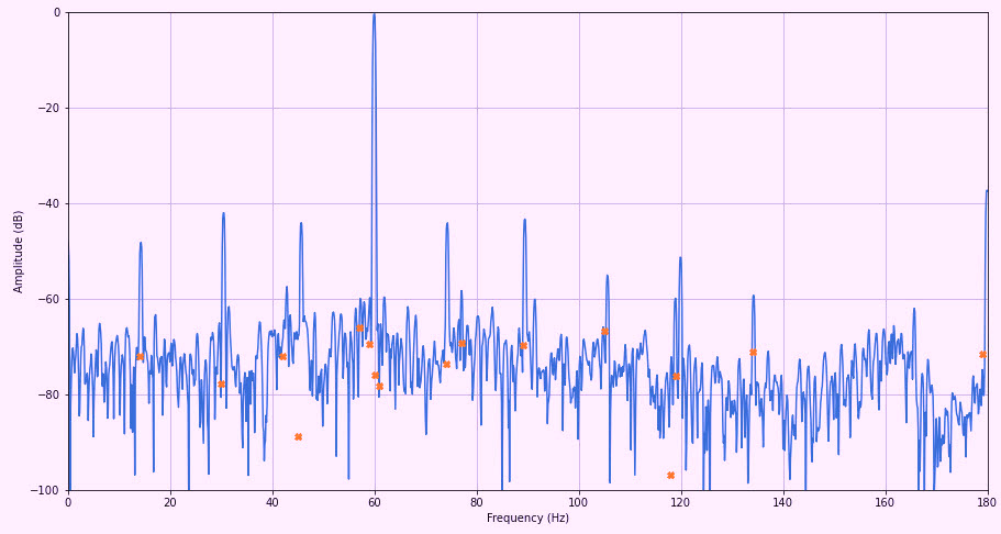
Fig. 4. A zoom-in of 0-180 Hz from Fig. 2.
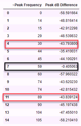
Fig. 5. Black box indicates the line frequency. The red boxes are the values of the running speed
on either side of the line frequency. The dB values are correct for the peaks of interest.
The peak frequency is an integer estimate of the peaks.
Zooming in this close to the high-frequency data shows a similar spectra and peaks as with the commercial package as shown in Fig. 6. Note that the dB values are within a few fractions of a digit when compared.
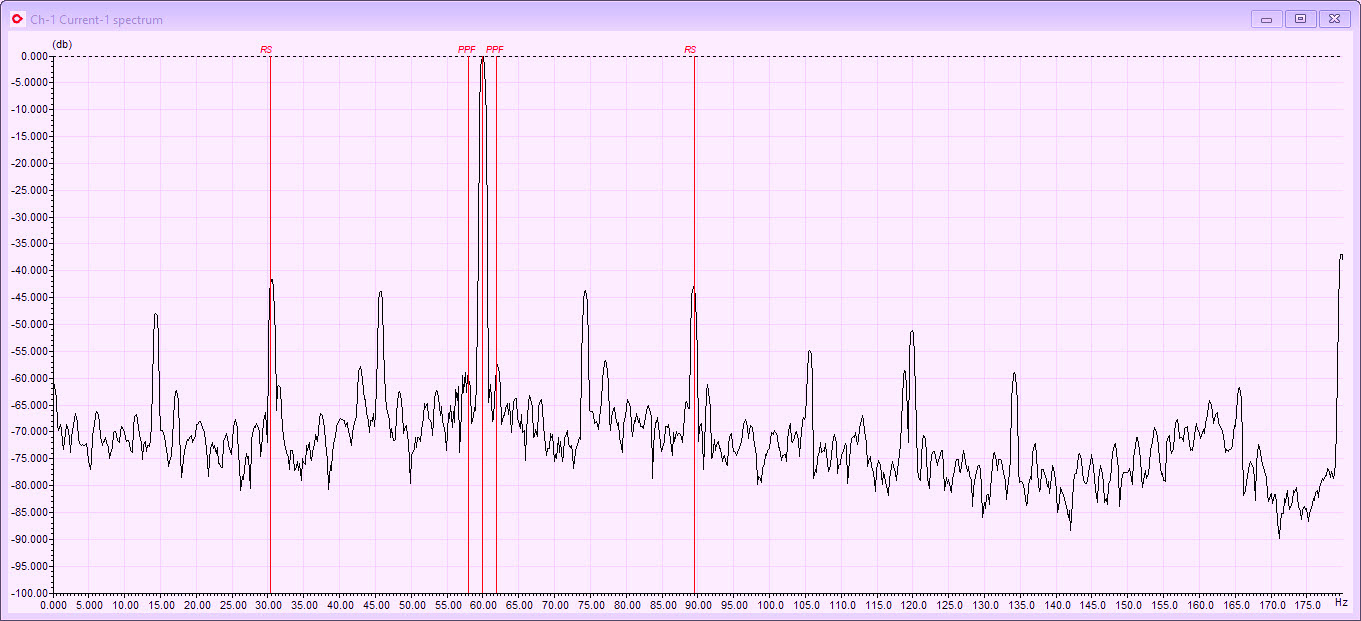
Fig. 6. Commercial-software-package presentation of the same data shown in Fig. 5.
If we want a better view of the area around line frequency (which is important to have in electric-motor- and driven-equipment analytics), we will use a longer time frame (48 seconds) at a lower sampling rate and then average the data. Doing so results in a sharper waveform that looks like Fig. 7.
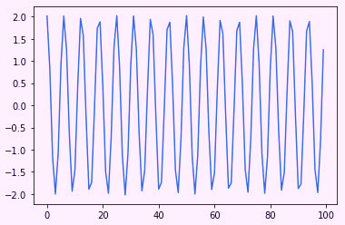
Fig. 7. Data from 48 seconds and an effective sampling rate of 376Hz.
When put through the same program as with the higher-frequency dataset, including finding the peaks, the resulting data shows as that in Fig. 8.
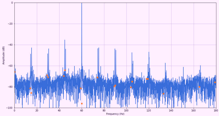
Fig. 8. Low-frequency, higher resolution data with peaks in red, which are rounded to integers
through the Python SciPy “find peaks” feature.
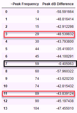
Fig. 9. Black box indicates the highest, or line-frequency, peak.
Red boxes are the running-speed peaks.
As can be seen in Fig. 10, the peaks are the same as shown in Fig. 8 and Fig. 9.
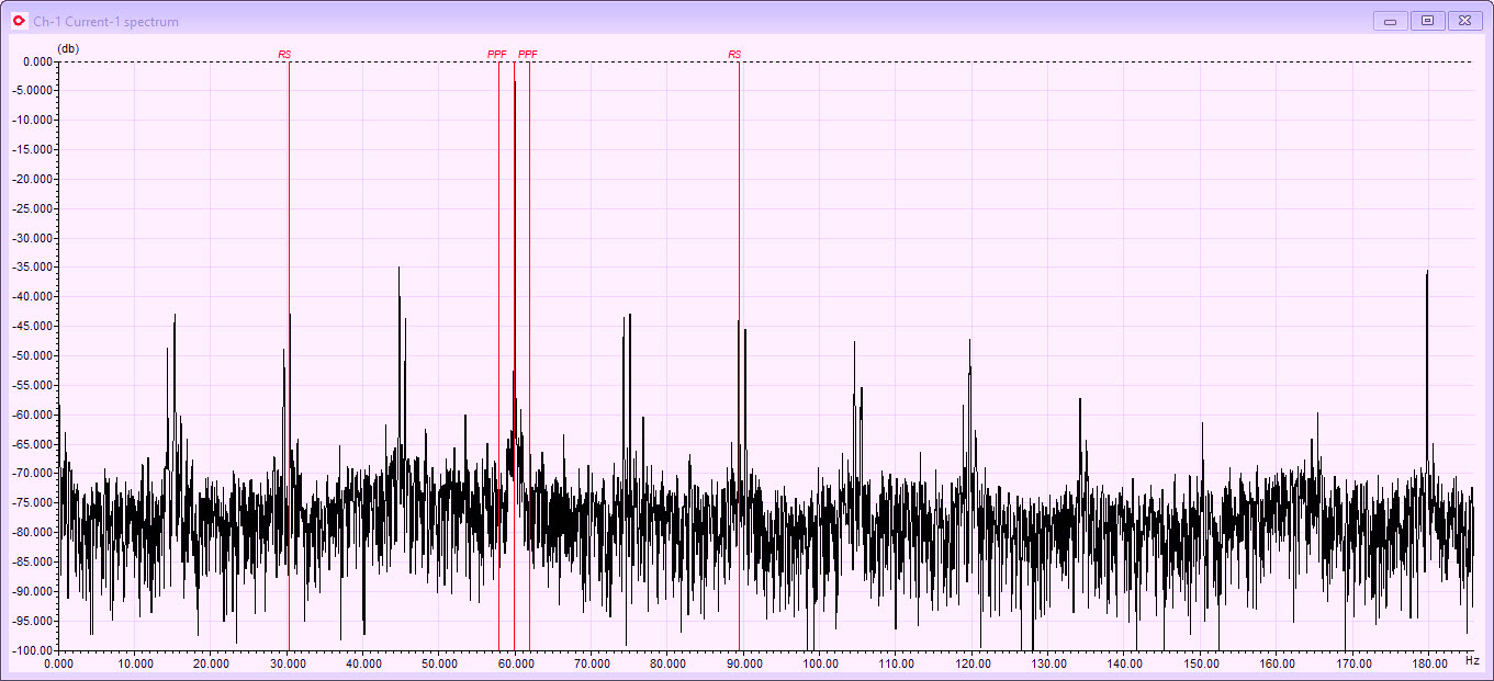
Fig. 10. Commercial-software-package presentation of spectra
using the same data shown in Fig. 8 and Fig. 9.
BOTTOM LINE
As shown in these images, the values and filters used by different devices or software can be quite similar. In this three-part article, we have identified sample rates, nyquist values for FMAX, windows and results, and identifying peaks. It’s important to note that these methods are not “machine learning (ML),” which is a different methodology that we will be covering in another article.
The techniques discussed over the course of this article involve spectra analysis and expert system analysis used in ESA, MCSA, vibration, ultrasound, and other data methodologies (including use of image data). Understanding the basics of various device capabilities with regard to sample rates, nyquist values, and windows provides users with the type of knowledge that lets them select the right tool for the job.TRR
ABOUT THE AUTHOR
Howard Penrose, Ph.D., CMRP, is Founder and President of Motor Doc LLC, Lombard, IL and, among other things, a Past Chair of the Society for Maintenance and Reliability Professionals, Atlanta (smrp.org). Email him at howard@motordoc.com, or info@motordoc.com, and/or visit motordoc.com.
Tags: reliability, availability, maintenance, RAM, asset management, electric motors, Motor Current Signature Analysis, MCSA, Electrical Signature Analysis, ESA, vibration analysis, motor testing